
A walkthrough
Twelve screens, captured from the running site during verification. Each one links to the live page — these are records of the real thing, not mockups of an intended one.
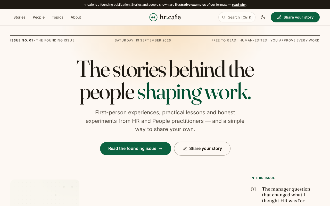
The front page
Masthead with issue dateline, a lead story, and the honest founding strip. The front-page grid borrows its structure from a print front page.
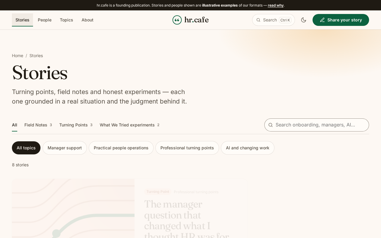
Browsing stories
Art-first cards with a featured wide card. Text tabs with counts on one row, topic chips below.
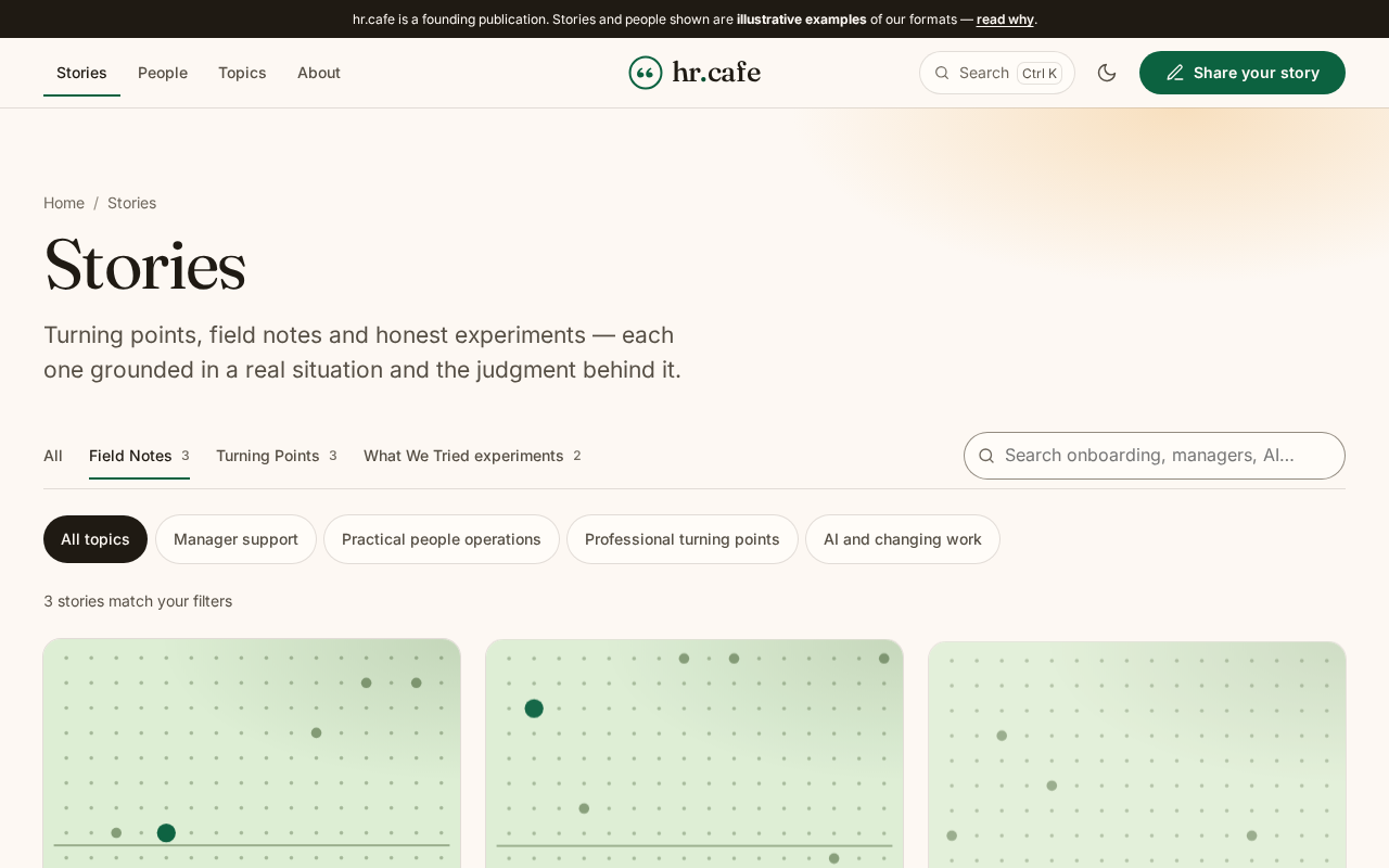
Filtered to one format
Filters are synced to the URL. Each format now also has a page of its own.
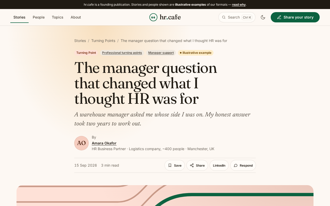
Reading a story
Key takeaways first, a context card naming role and org size, then the body at reading size with a progress hairline.
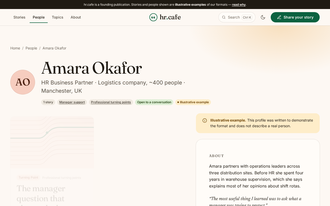
A practitioner profile
Monogram rather than an invented portrait, role context, and every story they have contributed.
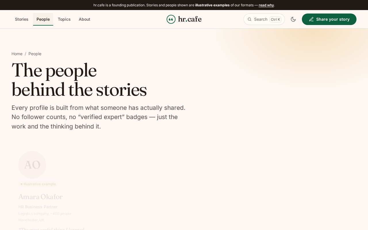
The people index
Discovery through work, not follower counts.
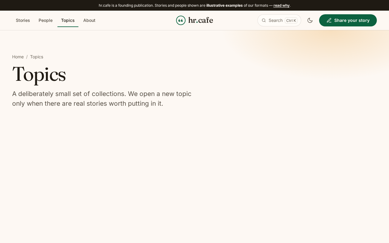
Topic collections
A deliberately small set. We open a topic only when there are real stories for it.
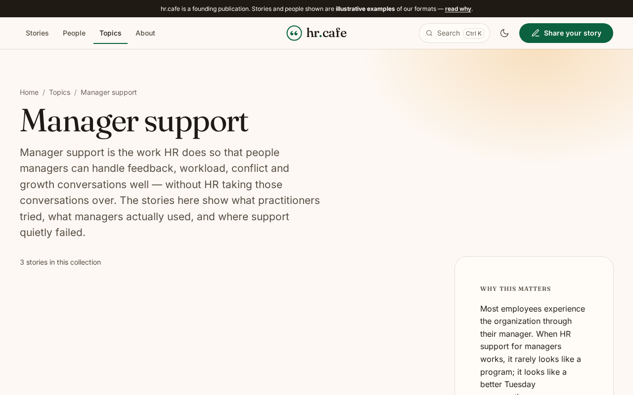
Inside a topic
Opens with a direct answer to what the subject is and why it matters.
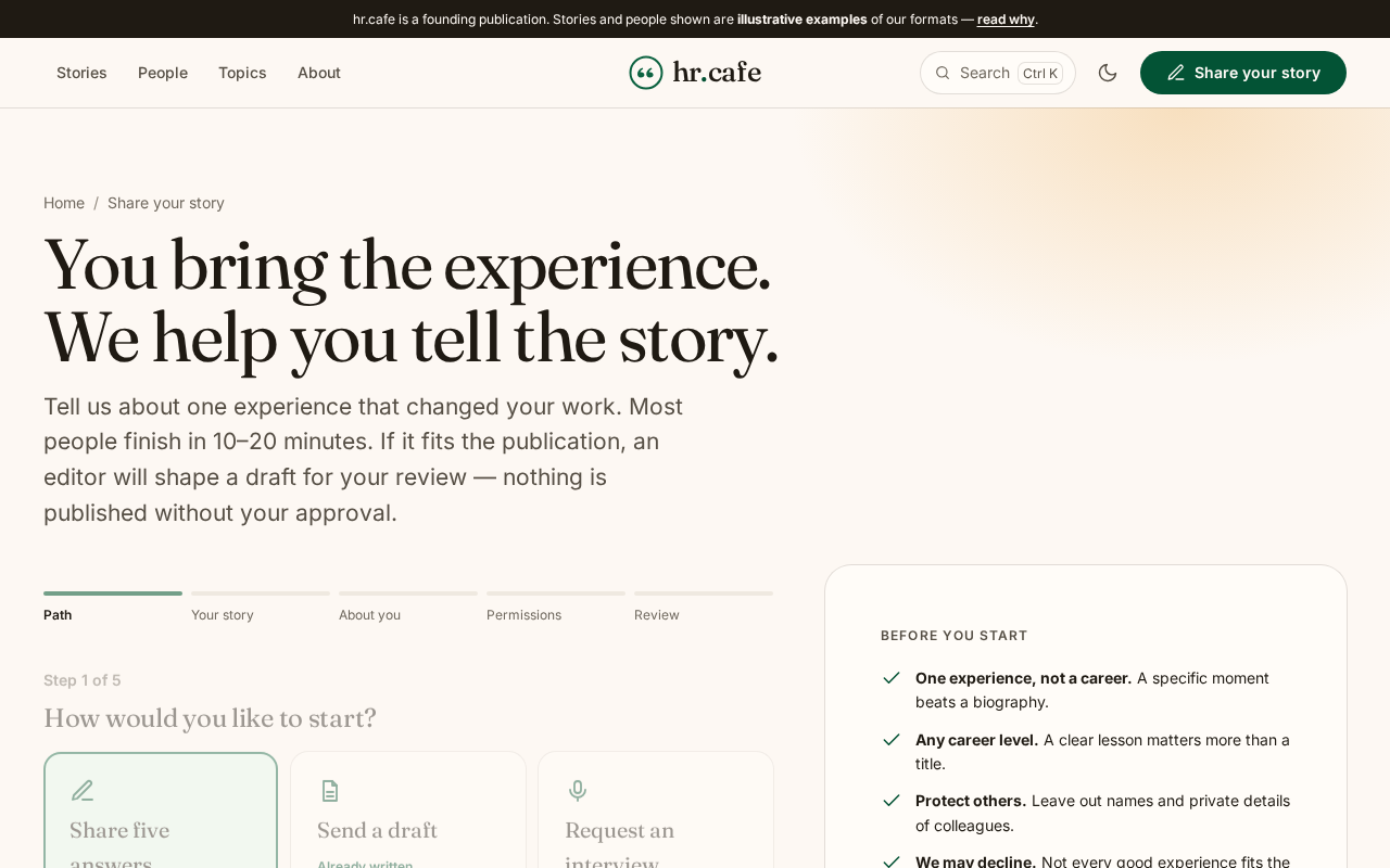
Contributing: step one
Three paths in. The five-answers path asks for five short answers and nothing else.
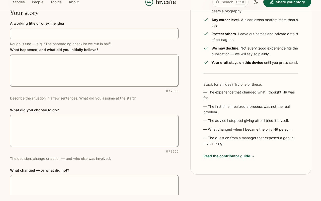
Contributing: the review
Rights and disclosure checks, then a review screen before anything is submitted.
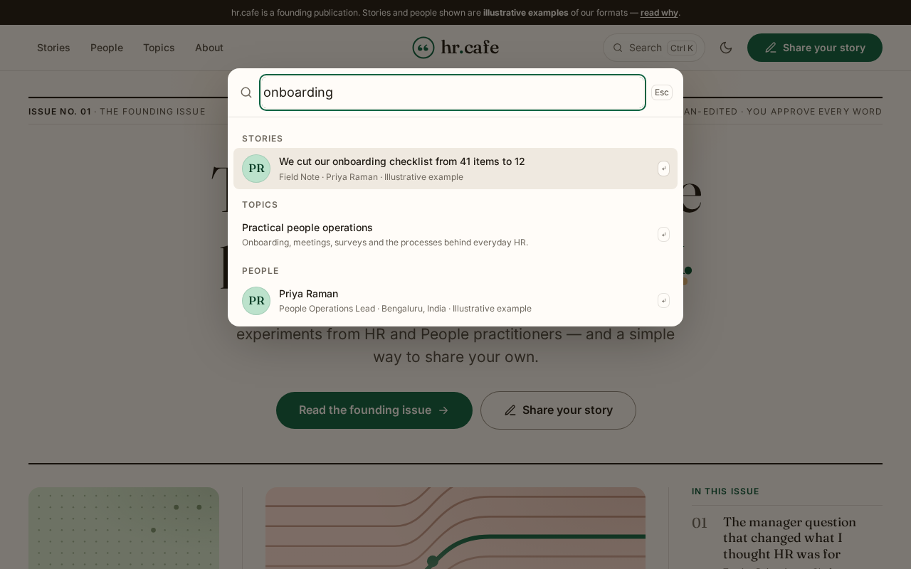
Search anywhere
Press ⌘K or / on any page. The index is local, so nothing is sent to a third party.
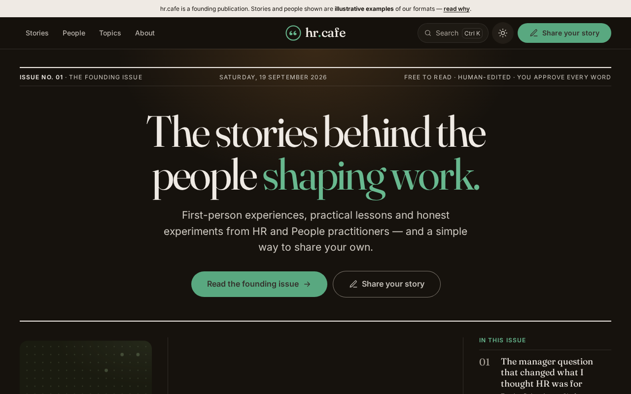
Dark theme
A real theme built from the same tokens, not an inverted filter. Zero contrast failures in either mode.
Every story and person shown is an illustrative example. They are badged as such on every card, byline and page, and are kept out of search indexes until real approved stories replace them. See the editorial standards.